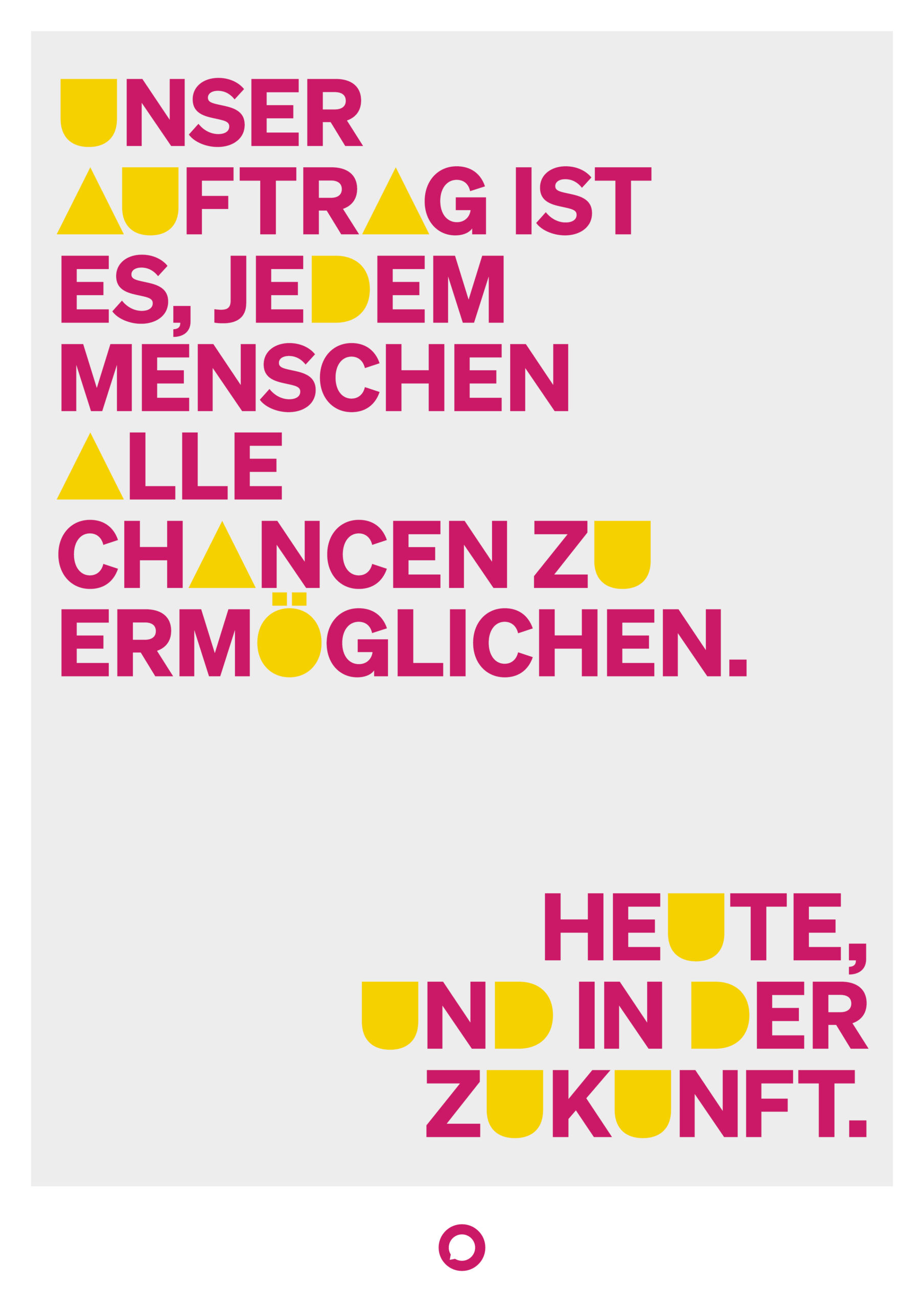
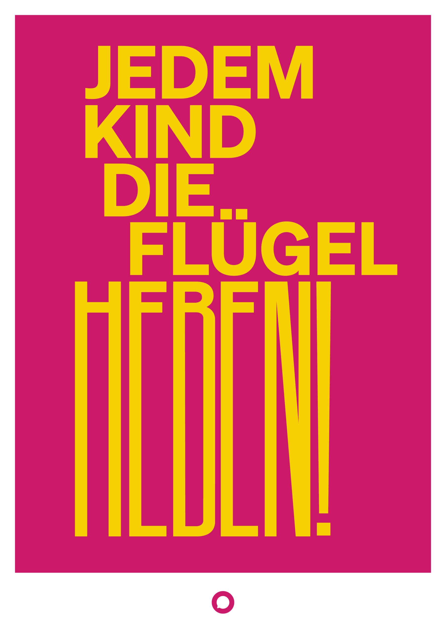
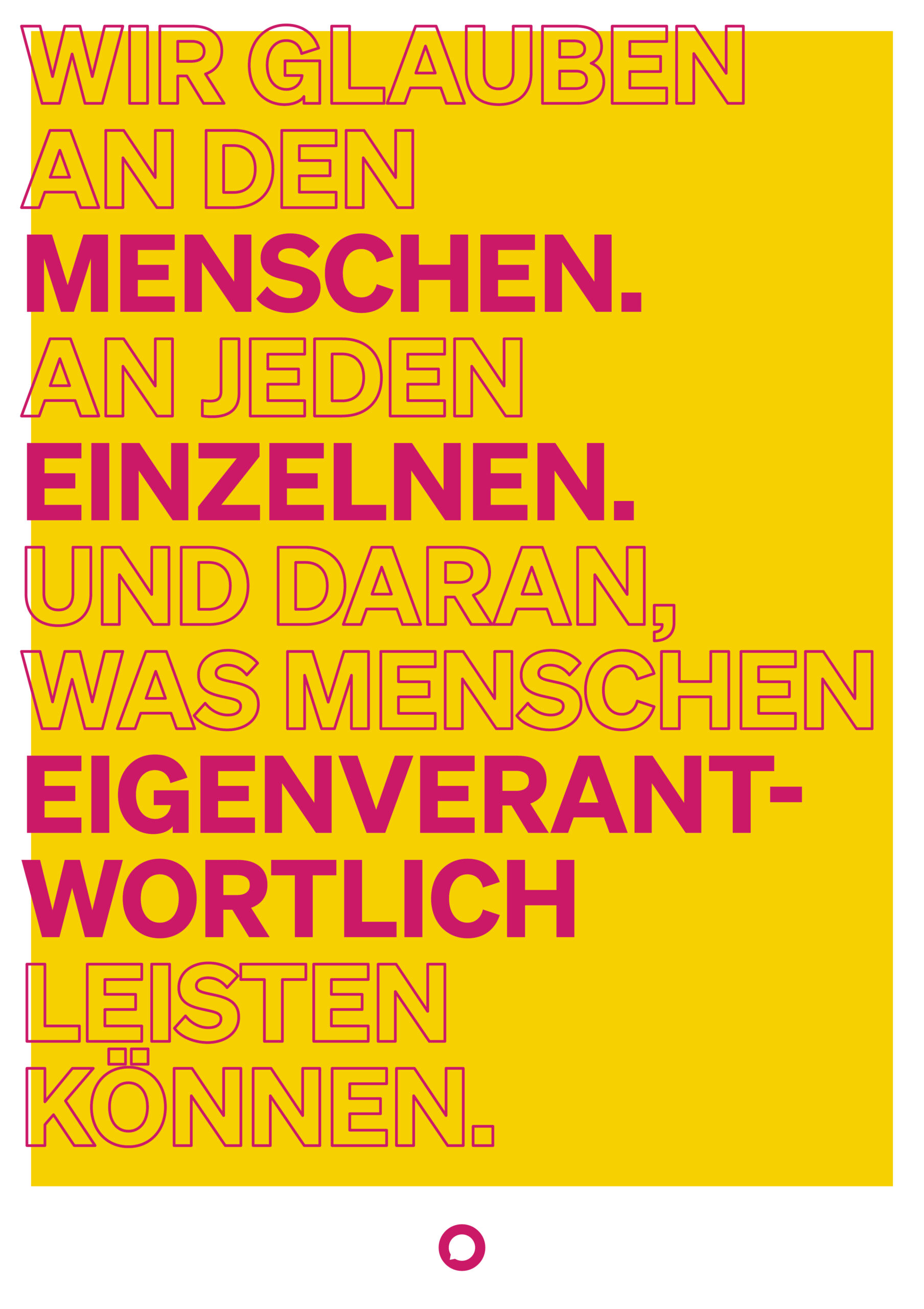
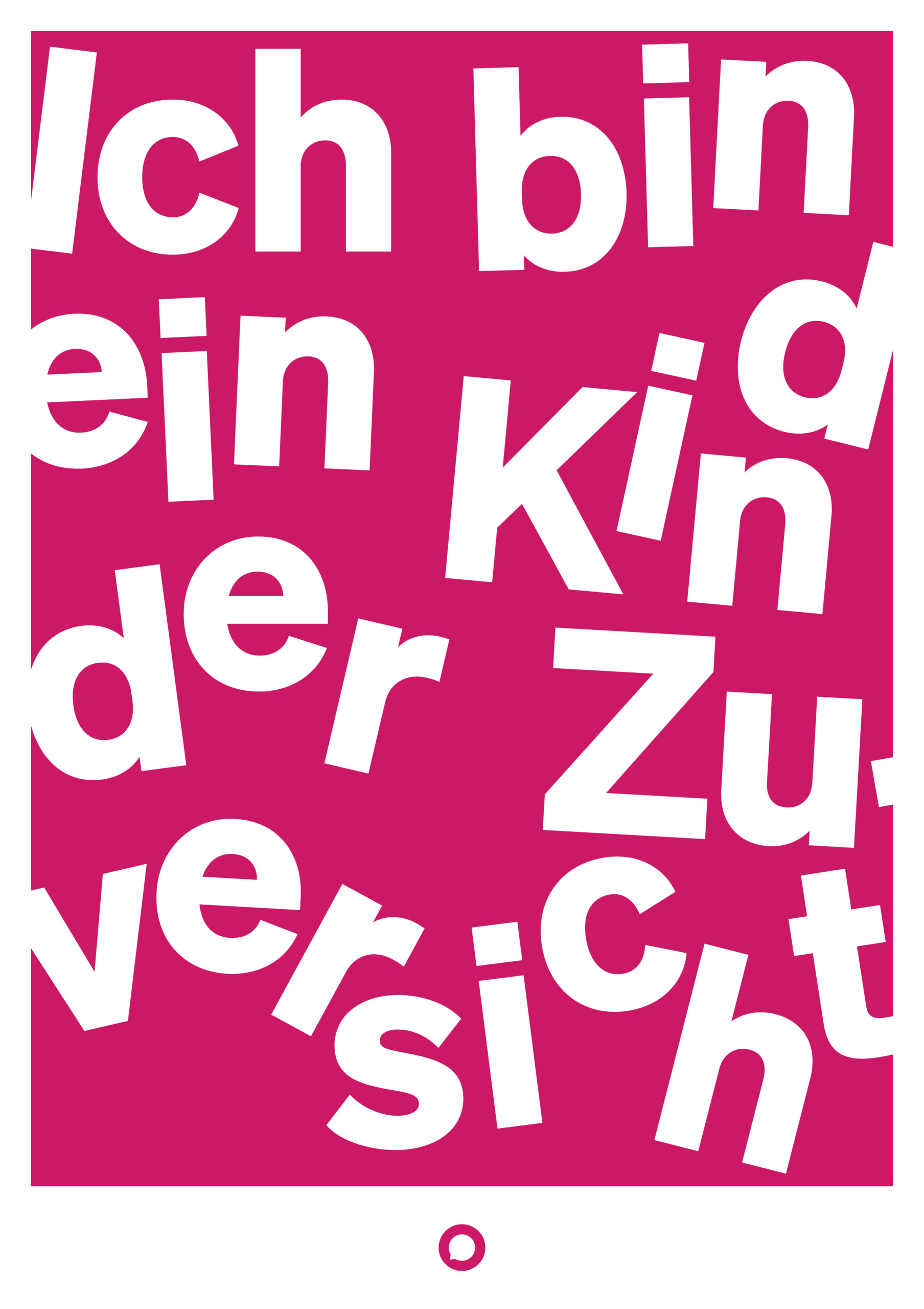
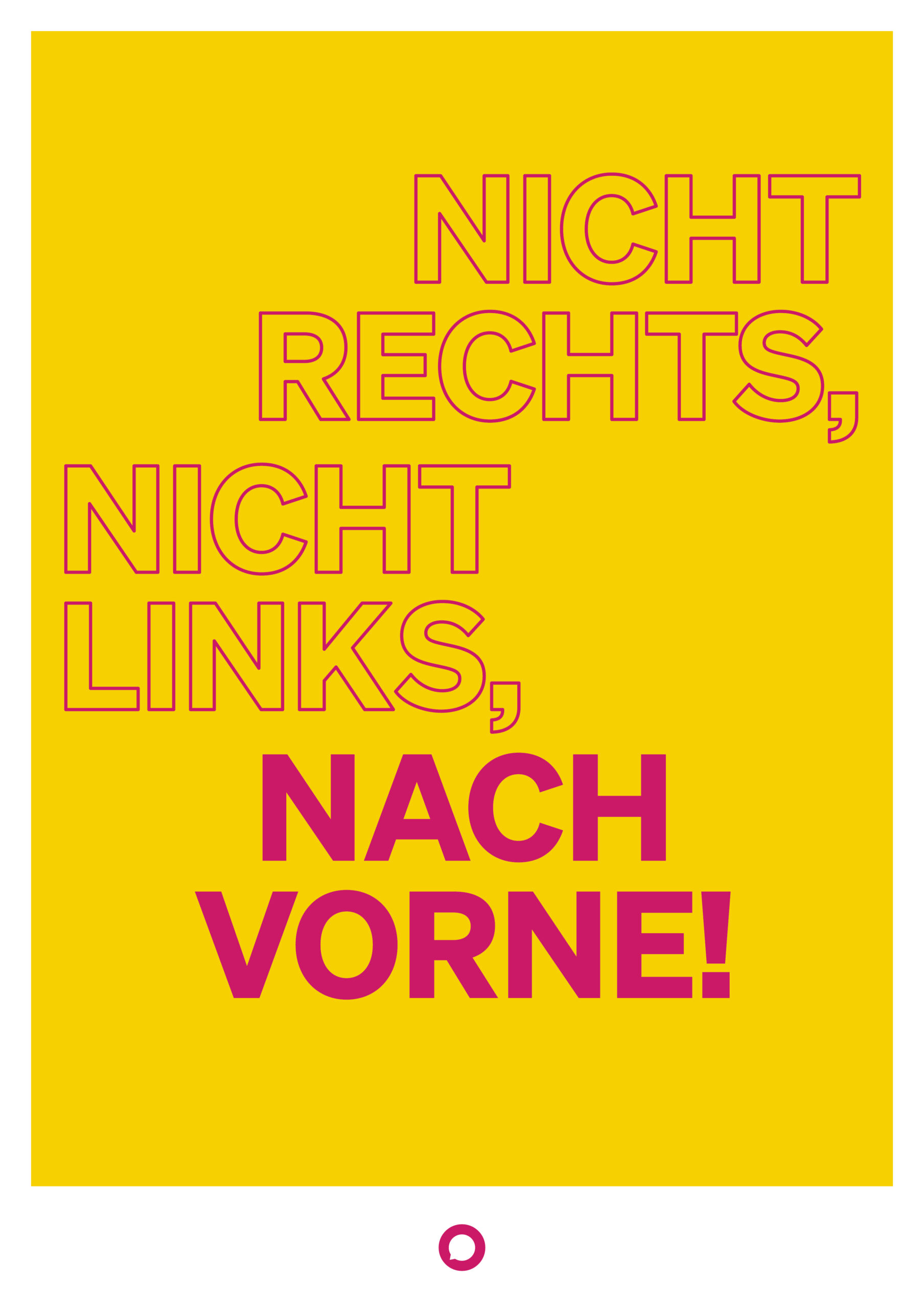
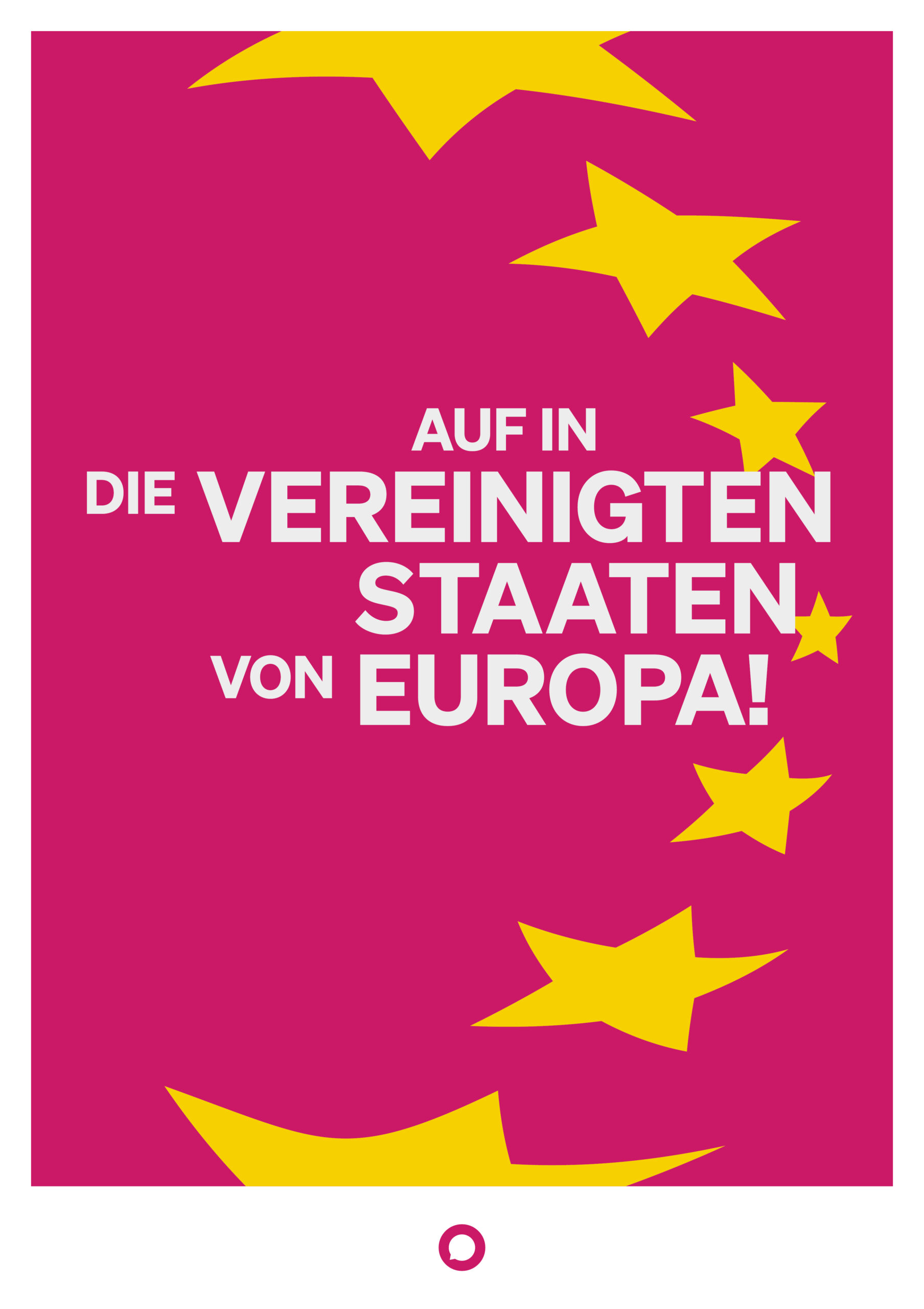
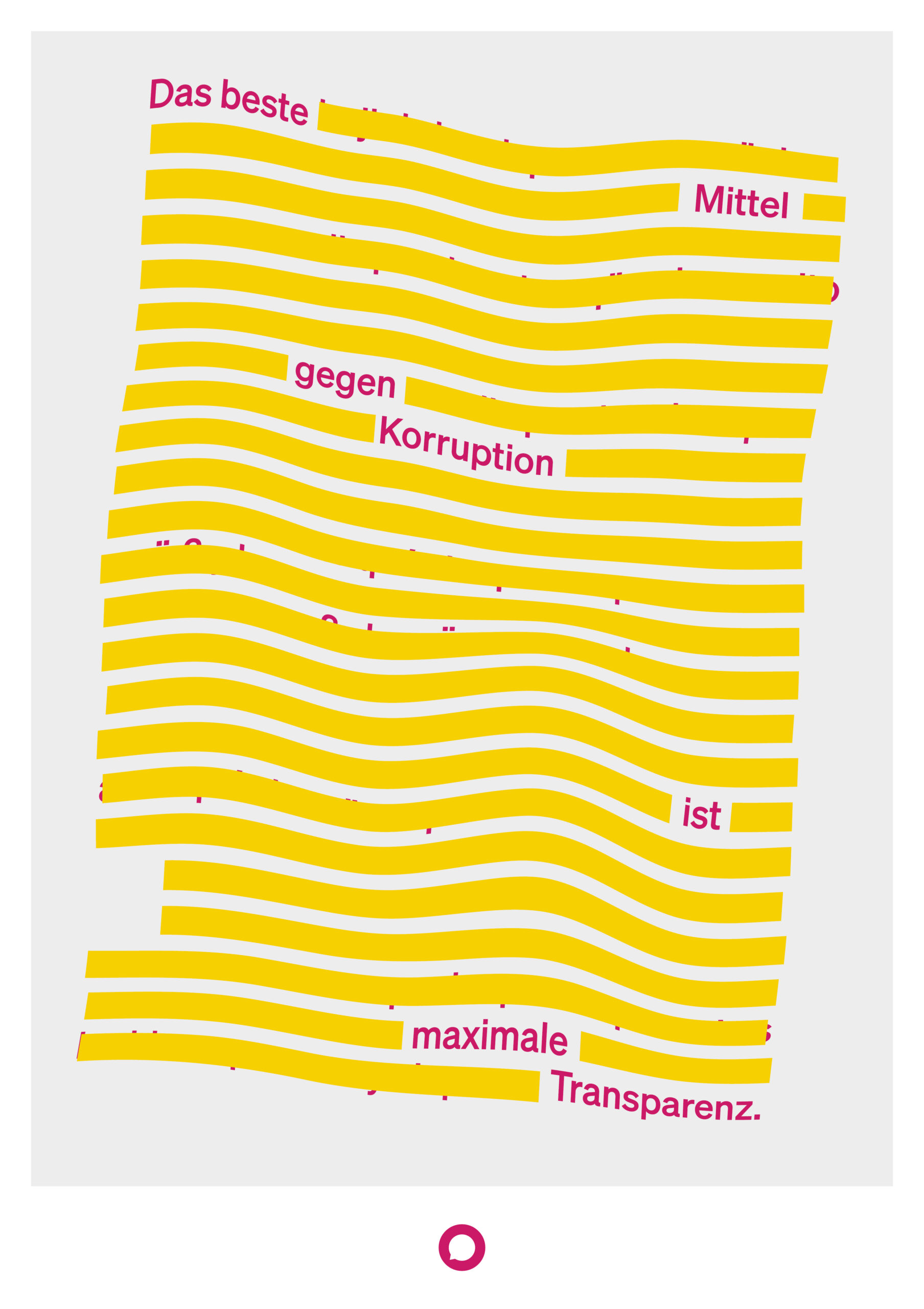
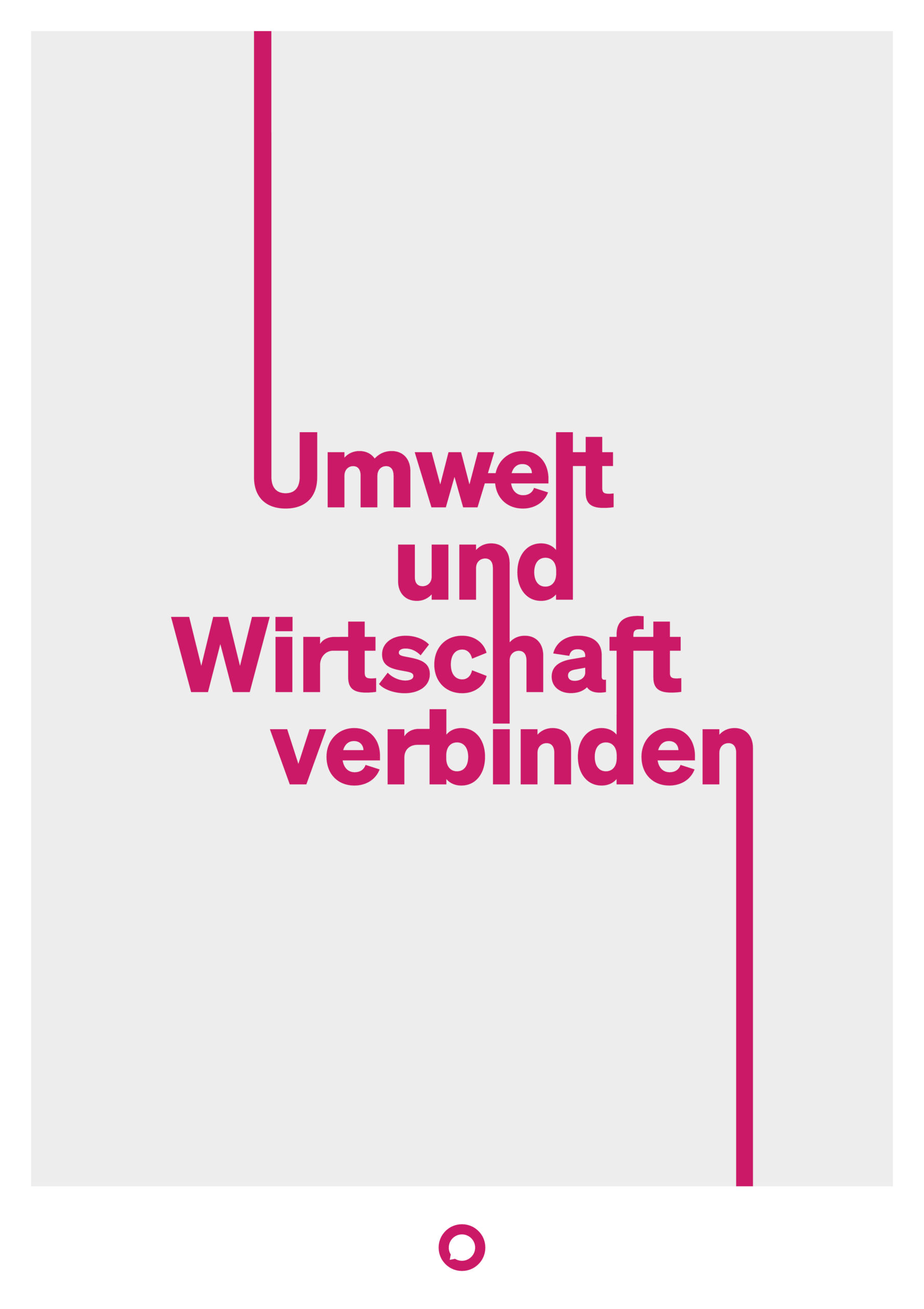
Design is a powerful way to communicate a message but also to create a thriving and creative environment. I recently created a series of posters with typographic design to promote and celebrate the goals of Neos (an Austrian political party). The process involved determining the key messages, selecting typography and a color palette, designing the layout, and refining the designs through feedback.
Let’s break down the pocess! (At the end you will find the results)
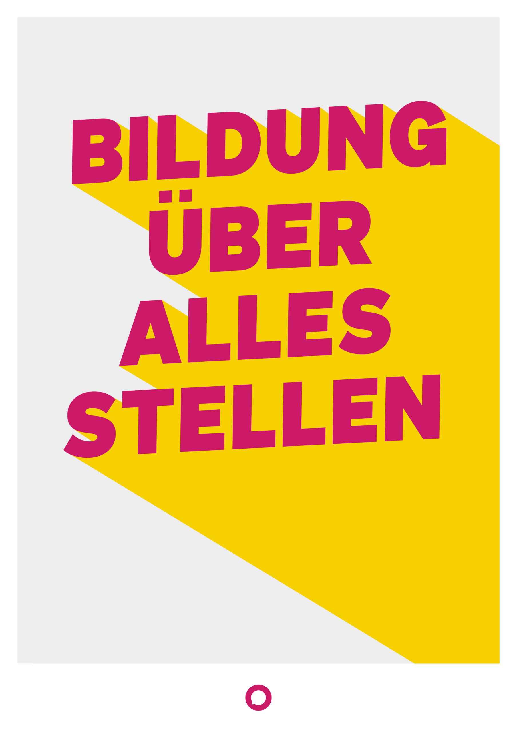
1. Visual Unity
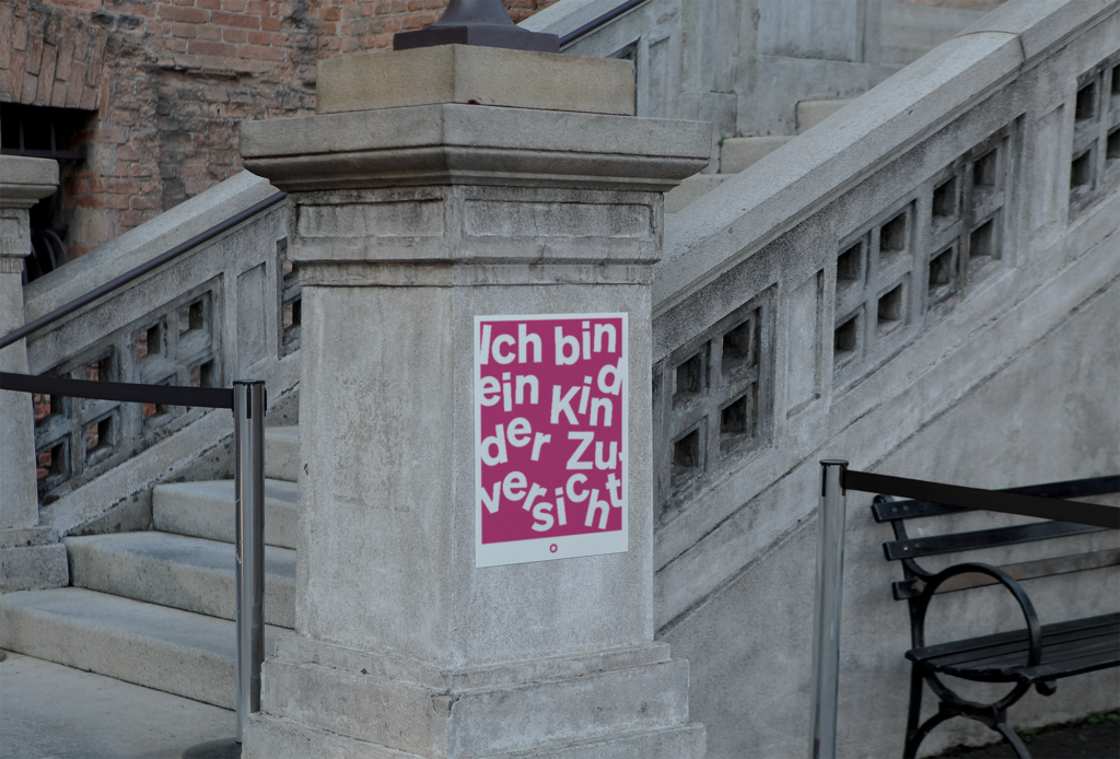
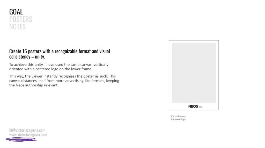
I had to create 16 posters! If I wanted them to be percieved as part of a series, I needed to achieve a certain unity, so I started with the format: vertically oriented with a centered logo on the lower frame. This way, the viewer instantly recognizes the poster as such. This canvas distances itself from more advertising-like formats, keeping the Neos authorship relevant.
Slide from Project Presentation
2. Visual Consistency
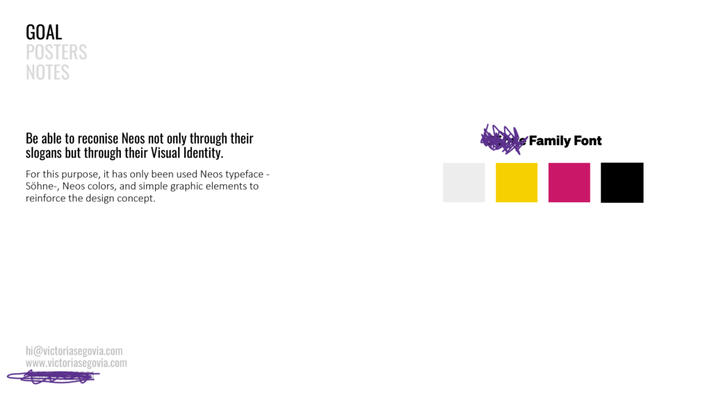
Being able to reconise Neos not only through their slogans but through their Visual Identity, was a key point. I decided to stick to Neos typeface, colors, and simple graphic elements to reinforce the design concept.
Slide from Project Presentation
3. Basking the Gaze
Once the framework had been set, the creative part begins. The parameters were limited, so the creative approach had to compensate for it and capture the concept and the idea of the slogan in a visual way. Needless to say that I prepared several designs for each slogan.
let’s see them!
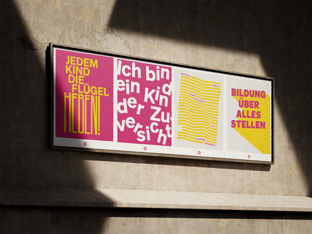
4. The Results!
And now the final designs. Two new designs were requested, followed by a feedback round. The others, received minor changes. The Logo and colors were adapted. In general, the client opted for brigther colors and clear lines.