Tea packaging traditionally emphasizes calm and soothing designs, mirroring the expected effect of the beverage. This has led to a somewhat monotonous landscape in tea branding and packaging.
Challenge
Empatea emerged as a concept brand with a vision to disrupt the typical narrative in tea packaging. The idea was to create a design that speaks directly to the emotional realities of consumers, particularly Millennials and Gen Z, who value authenticity and emotional resonance in brands.
Solution
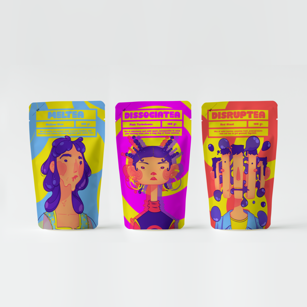
Empatea’s approach to packaging design was groundbreaking and untraditional for the tea industry.
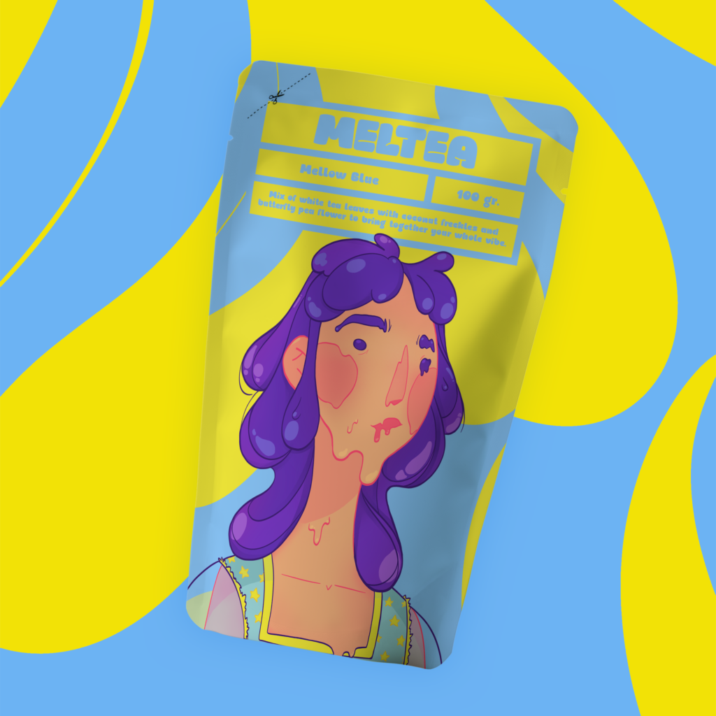
Product Line: The brand’s signature product, Meltea, is a distinctive blend of white tea leaves, coconut freckles, and butterfly pea flower. The composition not only promises a unique flavor but also symbolizes the brand’s commitment to capturing the contemporary vibe of its audience.
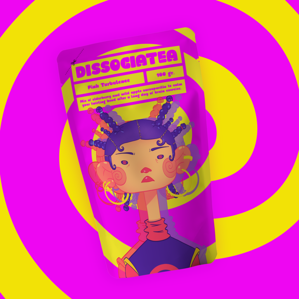
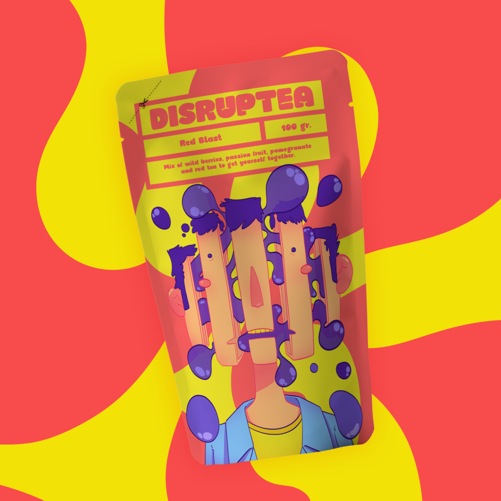
Design Aesthetics: Moving away from the standard tea packaging, Empatea embraced bold colors, dynamic graphics, and straightforward messaging. This design strategy aimed to strike a chord with younger consumers looking for brands that reflect their own truths and lifestyles.
Brand Messaging:Empatea positions itself as more than just a tea brand; it is aimed to be a part of the consumer’s emotional journey, offering empathy and understanding in the everyday hustle of life.
COnclusion
Empatea’s concept challenges the status quo in tea packaging, offering a fresh and honest perspective that aligns with the desires of contemporary consumers. Its innovative approach in design and messaging presents an exciting opportunity to redefine what tea packaging can be and how it connects with consumers on an emotional level.